

Background
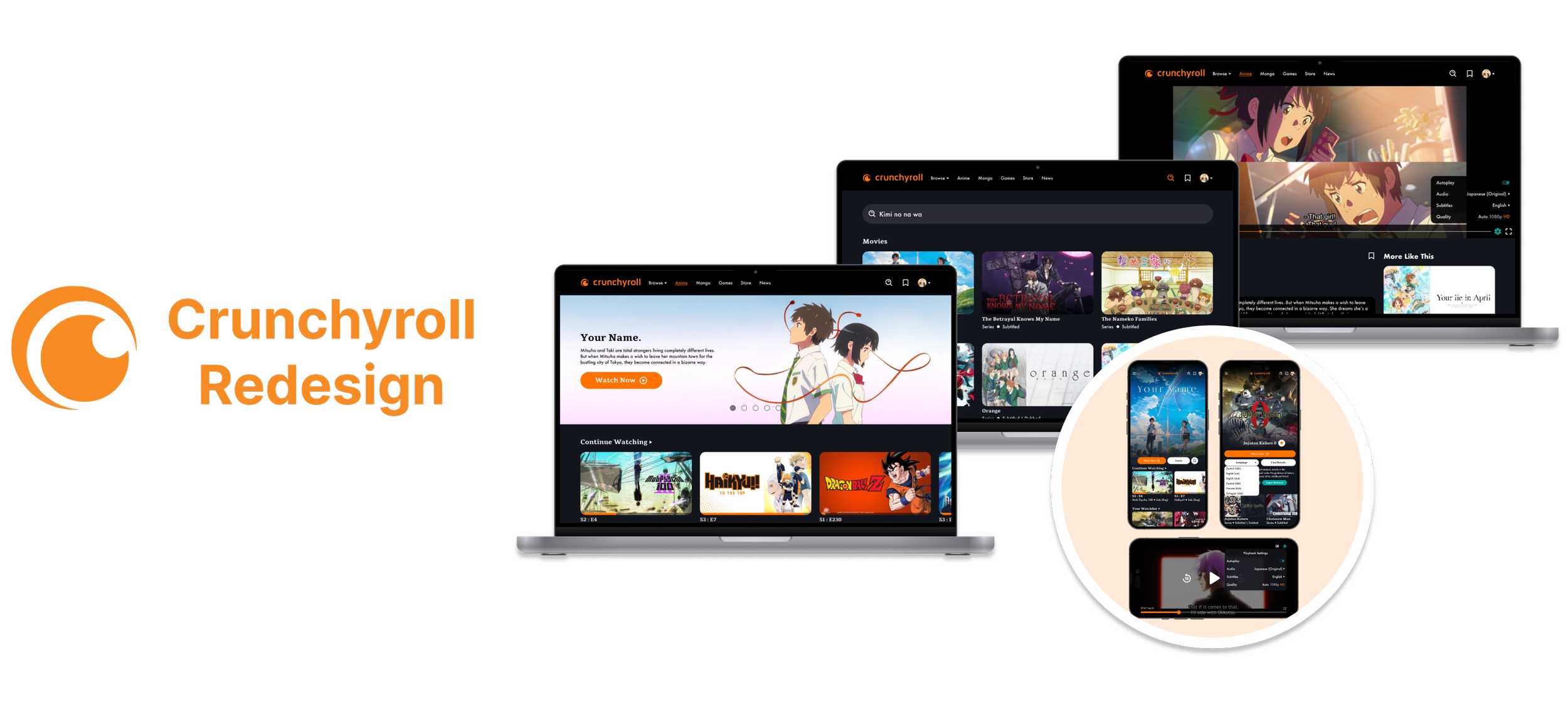
Crunchyroll is an American streaming service widely known for its anime options. This site also provides other features such as reading manga and and all the latest articles on anime news. This project is dedicated to redesigning their website to declutter its current design in order for users to not feel lost or overwhelmed while using Crunchyroll.
Problem
Crunchyroll users find the UI outdated, cluttered, and lacking responsiveness for mobile devices. They struggle to find anime in different languages. Redesigning Crunchyroll, improving information layout and language switching. The goal is to create a streamlined design, declutter the platform, and prevent conflicts between services.

STREAMING ANIME
Before streaming anime, users are able to choose a profile beforehand so they aren’t confused on who was watching what. In the video details page and video settings, users can easily select a language without having to look through the seasons pull down bar like how Crunchyroll originally designed it. This will help avoid any issues users had in the past with changing the language.
READING MANGA
The UI for the manga pages were extremely outdated and did not match the anime pages at all. I added a darker background to match the homepage and to give it a more modern look. I also added a hero section for popular manga. When reading manga users can now click “Read Chapter 1” instead of having to manually scroll all the way to the beginning. Lastly, they are able to choose between reading manga one page or having all the pages on the screen at once.
SEARCHING ANIME
The original design for Crunchyroll’s search page was just the search bar in the footer. I added in popular genres and popular searches to give users a sense of familiarity due to other streaming services having those options as well. The search bar will also recognize romanized Japanese titles to help users who aren’t aware of the english titles.
READING NEWS ARTICLES
Just like the manga pages, the news page was very outdated as well and extremely cluttered. I added a darker background so it matches with the rest of the site and fixed the horizontal width of the photos and text so it feels more like a news outlet.
MOBILE
The responsive design for the original Crunchyroll isn’t very accommodating for mobile users. This video illustrates the “streaming anime” flow on a mobile screen with a bit more spacing and features than the original.


Competitive Analysis
Because Crunchyroll is mostly known and used for its streaming, I did most of my competitive analysis on other popular streaming services to better my understanding of how users would want their series/movies laid out. I also added one manga website since Crunchyroll provides manga for its users as well.


Persona
After some user research and the findings of the competitive analysis, I was then able to create the persona “The Creative”, someone who enjoys using Crunchyroll to gain inspiration for their own artwork and designs.

User Interviews
I wanted to figure out what users would like to see and what would better their experience while using Crunchyroll. I interviewed three people and asked questions regarding their favorite streaming services and did a small usability test on the current Crunchyroll site to see what they like and dislike about the current design.


Project Goals & Feature Roadmap


After brainstorming the business and user goals, I created a feature roadmap to layout features I could realistically add into my prototype. Crunchyroll had many good features already built in so I focused more on the few that would help with their clutter and help users avoid any confusion.

Task Flow & User Flow
Now that I have mapped out all the possible features that could be added, I decided to create a task flow and user flow to narrow down necessary changes that need to be added into the redesign.


Product Requirements
With all the prior information gathered and creating these flows, I was able to solidify what features were the most important to have in the redesign.


Sketches
Now that I figured out what content and features I would like to add, I made a few sketches for the homepage, video pages, manga pages, and news pages to see what layout may work the best.


Wireframes
Homepage, Video Pages, & Search Page
While creating the homepage I thought about how users would get confused on who’s watching what so incorporating profiles was definitely needed. Then I made all the originally vertical anime titles horizontal instead to give it more of a streaming service vibe. In the details page I added a filter to change the language right away as users were unable to do so originally.

Manga Pages
The original manga page is extremely outdated. I added a hero section at the top and made the manga images bigger and easier to see. I also added a “read the first chapter button” since users have to scroll through how ever many chapters just to start a new manga. And lastly I added the option to read it one page at a time or if you wanted to scroll through the pages.

Responsive Design
For the responsive design I decided to the flow where the user chooses a movie from the homepage. I tried to make it as similar to the desktop version as I could while also making slight changes to the layout so users don’t have a difficult time navigating it.

News Pages
There are only two pages for the news pages so the goal was to ensure that it looked less cluttered and that the information is laid out in a way that is easier to understand.


UI Kit
For the font I chose tienne as the font for the headings and futura for the body font. The reason I chose to use these fonts was because I felt they were easier to read and also gave a more modern tone to Crunchyroll as well. The color palette was taken directly off of Crunchyroll’s and the iconography was meant to have a modern and fun tone portrayed by the bubbly features of the icons.


Prototyping


After establishing fonts, color palettes, and the photo treatment, I was able to begin my prototyping based off the main user flow that I created.

Homepage & Video Pages

Manga Pages

Responsive Design

Article Pages

Usability Testing
After creating the prototype I created a usability test script that asked users how they feel about the redesign in comparison to the original. I asked them to do tasks such as choosing a movie off of the homepage, searching a movie, and to “read” both a manga and a news article.

Mobile Revisions


The usability testing also established that there were a few small issues with the tint of the navigation bar, sizing of the save button, and the spacing.


Based off the feedback I decided to make some small revisions to the search, manga, and news pages. For the search page I made the height of the search bar smaller and added in the romanized title next to the English title. Users have also mentioned that they were confused by the right button on the first manga page so I simply removed it to avoid that issue. Lastly, the article page felt tiring to read due to its large horizontal width.
Affinity Map
Desktop Revisions
Next, I created an affinity map organize their thoughts better and to get a better grasp on the pros and cons before beginning the revisions.


Outcome
Redesigning Crunchyroll had its challenges due to being the only streaming service that also provides manga and news articles for their users. Users of the original design felt that the page was outdated, cluttered, and it was difficult to find their language preferences. The old design was extremely outdated, specifically the manga and articles pages, so creating a more modern look to Crunchyroll wasn’t too difficult. I decluttered the homepage by strictly having it be streaming, since that is what they’re most known and used for. Lastly, Crunchyroll had a language preferences inside of their seasons pull down on the details page and you were unable to change the language once you started streaming, so to alleviate that issue I added a language drop down both in the details page and while streaming. Recently Crunchyroll has updated a bit and let users change the audio and subtitles in the video settings now and have taken out the language options from their seasons pull down further validating the need for this redesign.

Let’s Connect!
I am always open to new projects and experiences. Feel free to shoot me a message at herbert.suarez97@gmail.com