


Background
FoodieCall is a dating app where users can save restaurants they’ve been meaning to try and can match with other users who have been wanting to go to the same place. This can be used both platonically romantically and is made to help users meet with people around their area.
Problem
Dating apps can be frustrating as users struggle to move from matches to actual dates and conversations. Additionally, people new to a city often experience loneliness and turn to dating apps for connection. FoodieCall addresses these issues by offering a conversation starter based on shared food preferences and simplifying date planning. This app not only facilitates romantic or platonic relationships but also helps users connect with their local community, combating feelings of isolation.

PROFILES
When on the explore page users are able to look at “Foodies” (other profiles nearby) or “Food” (where you can search for restaurants). When looking at a profile, users are able to see tags that describe them as the first thing seen along with all their basic information right under it. There are also prompts so users can get a feel of the person’s personality and pictures that they can like as well.
SEARCHING AND RESTAURANT DETAILS
When clicking into the search bar, it will show users some recommendations. When they type in a certain food it will show users all places near them. After choosing a restaurant uses are taken to a details page where they can see the photos, ratings, menu, contact information, map, and reviews. From there, they are able to pick a place they would like to go and find people who are interested in the same spot.
LIKES PAGE
Users are able to see everyone who likes them when they press the “Likes” button in the navigation bar. They can scroll through their photos, a restaurant they have in common, what about their own profile that the other person liked, and the profile of who liked them. From there, users can choose to match or decline these people or do it directly from their profile.
ONBOARDING
Before using any sort of dating app, users have to go through an onboarding process. Incorporating a progress bar is useful for users so they’re aware of how much more information they are expected to fill out. There are also many users who often get overwhelmed or bored with onboarding. To deal with that problem it felt necessary to include a “skip for now” button so users can use the app right away and finish up their profile whenever they feel like it.
CHATS PAGE
Users would find their matches in the chat box. People that the user has not spoken to yet will appear at the top under matches, and the ones that have spoken to the user will be under chats. The red dot next to the names means that it is a new match and the green dot indicates that they are currently online. When chatting with matches, users are able to press the peach at the bottom right to see what places they’ve saved and can send it to their matches to help plan dates.


Primary Research
While conducting the research I wanted to figure out how users feel about finding relationships that are either romantic or platonic online, the importance of sharing a meal with someone, and why people who barely eat out choose not to.


The research has shown me that dating apps are often times used for many different purposes. Straight people tend to want to find a significant other while LGBTQ+ people use it to find community. It’s also evident that platonic relationships are good for avoiding illnesses and early mortality as well. Lastly, the results of the research shows that sharing a meal with someone plays a huge role in a person’s individual happiness and sense of community.
User Interviews


After the primary research and competitive analysis, I interviewed users who use dating apps about their likes and dislikes. I asked them about their favorite dating apps and what features made them stick out more than others.


Competitive Analysis
I did research on the top three dating apps Tinder, Hinge, and Bumble in order to get a good grasp on what does and doesn’t work for them. Bumble also has a BFF option so users can make friends on it too. I added yelp since it’s the most well known food app and it would help with what important details are required when presenting a restaurant. Lastly, dine is the only direct competitor to see why the app wasn’t as successful as it could have been.
Persona
Lastly, I created a persona for William Chan. He’s an "Introverted Foodie" who enjoys making friends and is looking for a romantic relationship. However, he struggles to find like-minded people in his area who share his passion for food. FoodieCall can be the perfect app for him to connect with similar people in the area.


Empathy Map
Next, I created an empathy map to help organize the information I got from all the interviews.

Storyboard
This storyboard represents the type of users that would use FoodieCall. This is about a man who finds it difficult to start conversations and go on dates.

Project Goals & Feature Roadmap


By envisioning the app's functionality and creating business and user goals, the feature roadmap became clear.

Product Requirements

After creating the task and user flows it has become clear what main features needed to be added to ensure that FoodieCalls keeps their users engaged.


Task Flow and User Flow
Now that I’ve listed out the possible features and mapped them out, creating the task and user flows were easier to visualize. For the task flow I made a flow of a user browsing matching with someone through choosing a restaurant on the explore page. The user flow includes that same flow but also finding matches through searching a restaurant and going to your likes. It also includes users you’ve already matched with and planning out a date right away.
Sitemap
Once done with the feature roadmap, I created a sitemap as well to help visualize and structure the way I would like FoodieApp to look. The navigation bar would have an explore feature that would allow users to switch between profiles and restaurants so it better suits the needs of different people. I also added the option to switch between a chat and a person’s profile so you have easy access to who the person is while having a conversation with them.


Protyping
I began to prototype after finishing the wireframes, UI kit, and logo. I show the many different routes you can take to match with someone such as through the “Foodies” section, the search bar, and opening your likes. Once matched you can then chat with them and use a feature to send a restaurant that you have mutually saved with them.

UI Kit
Icons


Wireframes
While wireframing, I tried to keep in mind that it’s an app that combines two ideas: Food and dating. I had to ensure that I didn’t focus too much on one idea so users don’t get confused. These frames show the a bit of onboarding, the explore, restaurant details, and chat pages.
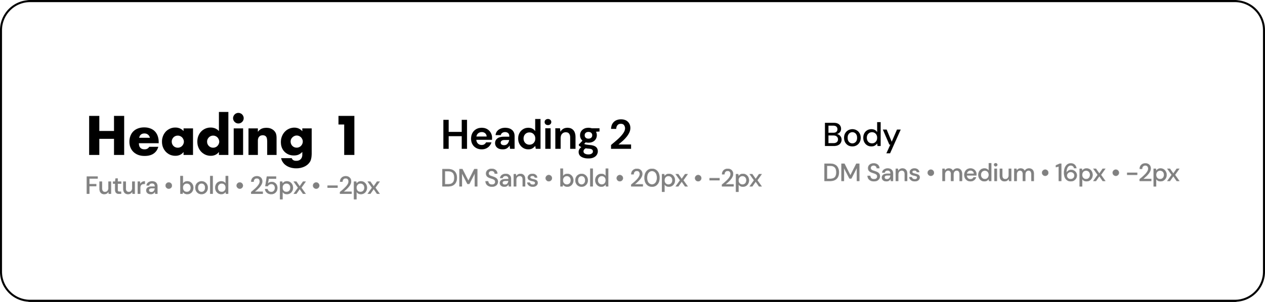
Typography
For the Typography, I chose Futura for Heading 1 because it’s naturally thick which is great for catching a user’s attention. I used DM Sans for Heading 2 and body because it looks similar to Futura with slightly rounder characters that give it a more modern feel.
When creating the logo for FoodieCall, I chose to go with a peach since it looks similar to a heart. Because of this, it matches well with the dating and food app theme that I was going for.
Colors
When choosing the color palette I took actual colors from a peach. The orange-red color fit perfectly with FoodieCall due to orange being associated with optimism and red with love and passion. Green became the secondary color as it is often related to success and safety.

Logo

Buttons
I decided to make the primary button orange-red since that was the color that was mostly shown in the logo. Green was barely shown in it which made it a good choice for the secondary button.
For the main icons, I went for unfilled ones that would later be filled with the primary color in their active state. The other other icons are aren’t seen as often and are already filled (such as the video and phone call icons).


Usability Testing
Next, I conducted usability testing to obtain feedback from individuals interested in using a dating app. Participants were asked to share their screens as they completed a series of tasks, such as matching, searching for restaurants, and engaging in chat conversations. Throughout the process, they were encouraged to share any thoughts that came to mind to provide insights.

Revisions

Finally, after receiving feedback, I began to make the changes that I felt were necessary and the majority of users from the usability testing stated as well.


Outcome
My main takeaway from creating the FoodieCall app is prioritization. It was difficult combining two completely different ideas into one and I had to explore various routes of how this information should be displayed and what should be prioritized. I came to the conclusion that I wanted it to feel slightly more like a dating app and as a result, I put profiles that you can look through as the first thing you can do when you open the app. While creating the food pages I had to constantly remind myself that it was also a dating app and I had to incorporate certain functions that would ensure users wouldn’t be confused.

Let’s Connect!
I am always open to new projects and experiences. Feel free to shoot me a message at herbert.suarez97@gmail.com